
Canopy of neighbors
Rebrand for an age-in-place “village” for seniors in Buffalo, NY.
Services: Brand identity design
Create new pathways to age independently in the community
Company mission
Growing old can be tough—you want your independence, but also to be with family and friends. And while you don’t want to be a burden to anyone, you need help with some things.
Retirement homes have a ghastly reputation for a reason, and they’re far from cheap. Most people would prefer to grow old in their own home.
The team at Canopy and their volunteers make that possible. As part of the ‘village movement’ that’s spreading across the country, they've created a service that allows members to socialize at weekly events, get a ride to the doctor, or have a lightbulb changed by a volunteer, all while remaining at the home they love.
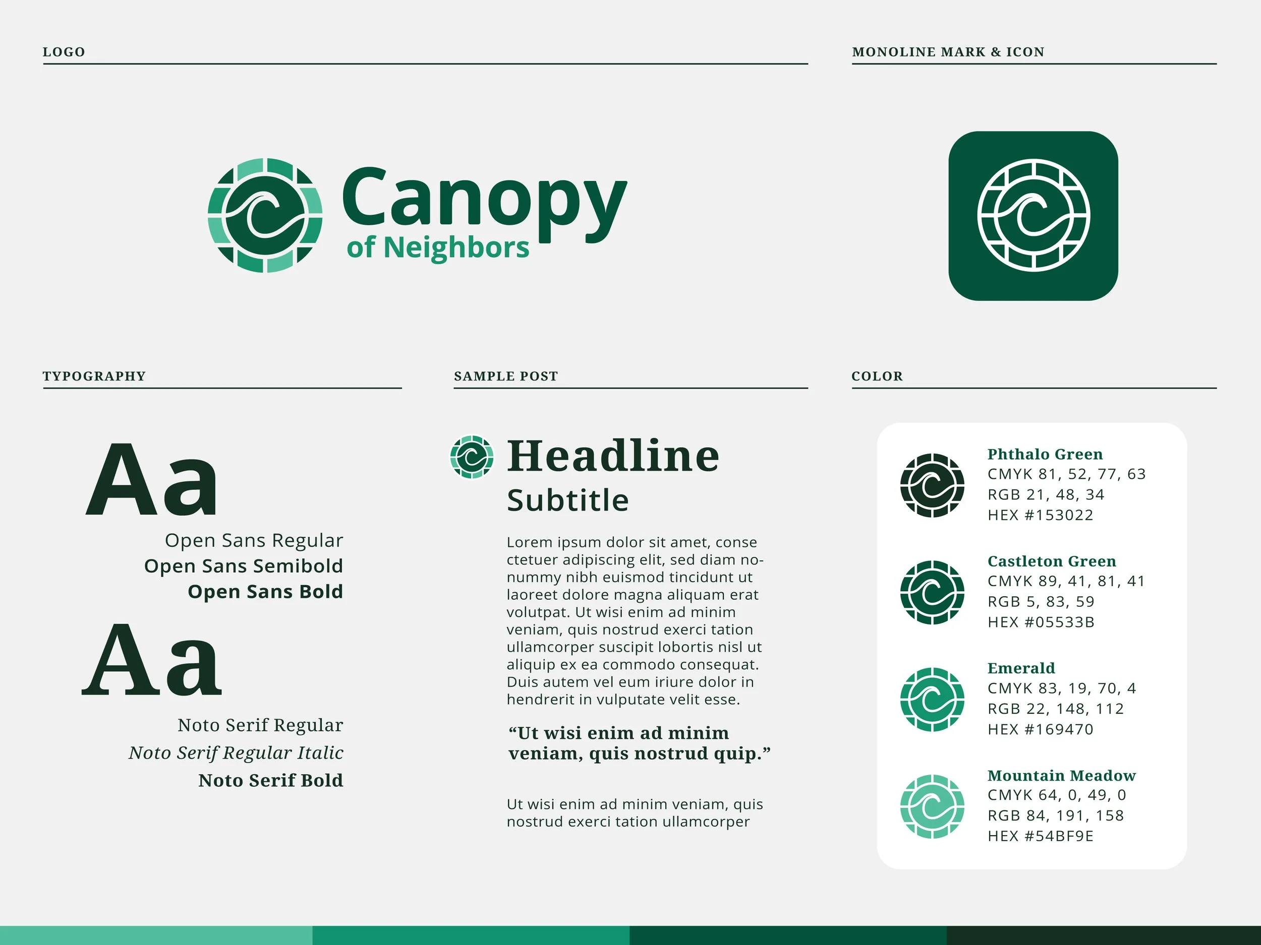
Style Guide
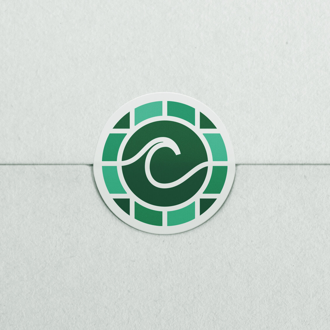
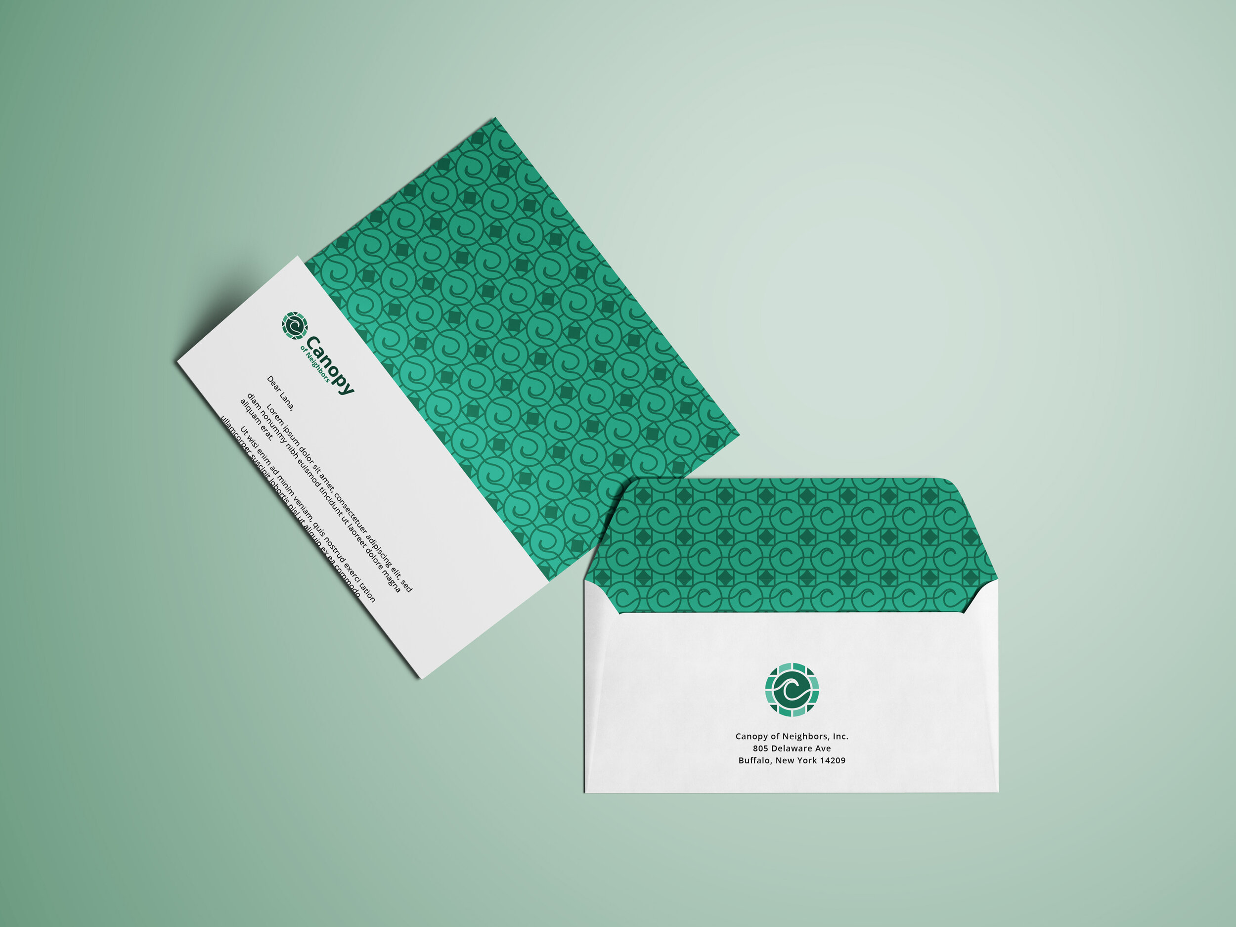
Sticker and Envelope
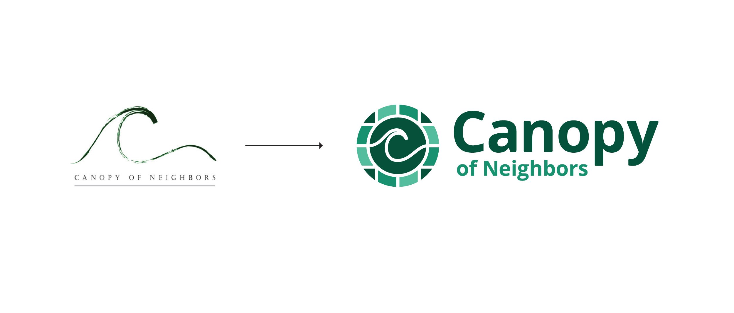
This rebranding had its challenges. The founding partners required us to keep the “wavy C" from their old identity. We also needed to bring a modern energy to their brand - though this was also an opportunity.
By depicting the “C” as a pathway in a park or neighborhood, we managed to give the “C” more value—a symbol of bringing people together and supporting one another. Additionally, thought of as ‘the walk of life.’
Other positives: The "C" adds a human (organic) aspect along with a friendly energy. Good logos don’t show what a company does, they highlight a company’s values.
The Design Process

Sketching
Starting with mind-mapping (writing simple thoughts that branch into others) and sketching, I create a mass of concepts until things start to click.

Refinement
Combining multiple concepts nearly made the mark too complicated, so we had to simplify.

Concept Further Explained
Stained glass windows were used as inspiration to bring in structure and warmth to compliment the “park pathway” approach. Stained glass influenced the color treatments as well, going with sea green hues for their calming abilities.
Life is not a straight line. It’s truly a journey.

What the client said:
“George’s work was transformational for our company. At the beginning, I could tell that he not only listened to our story but he actually heard us. It’s rare to have someone pay that much attention to the details that are instrumental in helping to define your brand.
He went above and beyond, followed up with questions, and did his own research. Just as importantly, he didn’t discount my opinions during the early drafts — it was truly a collaboration that brought that best out of our non-profit. Our new logo design not only speaks to our mission, it sings the praises of an exceptional and passionate creative mind. I can not recommend George enough!”